The thing about digital editions that bugs me isn’t the theory, it’s the practice – I’d rather flip through real magazine pages than virtual ones any day. The web is for skipping from site to site and idea to idea – even if I read a long article online (and I often do), I rarely read more than a few in sequence from one site. The magazine experience is missing online, no matter how you try to package your digital material.
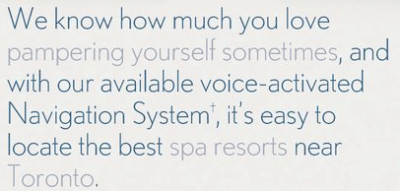
But even worse is Time’s new Mine Magazine, which finally arrived in my inbox not too long ago. I wrote about the concept back in March and how I felt it was missing the point of creating an experience for the reader – the whole package has no personality and no consistent vision. Even worse, the “personalized” ads are beyond awkward (why “sometimes”?) – and I’m not quite sure why they put the fill-in-the-blanks text in grey:

They don’t seem to have done anything with the art – individual articles still carry the original magazine’s formatting and section name – and I found just flipping through it rather jarring.
Here, have a look. What do you think?
 |
 |
|
| I'm there says: | |
breesir, to answer your question, the reason magazines don't have dedicated web editors is quite sim... |
|

