Canadian Magazine Industry News
22 January 2014, VANCOUVER
Vancouver mag redesigns for more cohesion
Vancouver magazine has undergone its first complete redesign in seven years. The look was spearheaded by art director Paul Roelofs, who joined the team a year ago.
Editor-in-chief John Burns says the magazine lacked a cohesive identity. "The stories sounded different between the beginning and the back of the book. Visually, some parts were highly packaged and others were more loose and airy," he said.
The new approach breaks down silo walls that have built up over the years. Sections walk in step using the same colour palette, font choices and photo treatments, and navigation has been made easier with signposts. Content-wise, tone of voice has been made more consistent.
Each cover indicates an overall package for the issue, like whether it is a Wine Awards or Entertainment issue, for example. "Not that we didn't put those things on the cover before, but we also put 1,800 other things on the cover as well," said Burns. The logo has been redone with a version of the mag's new Miller body font.
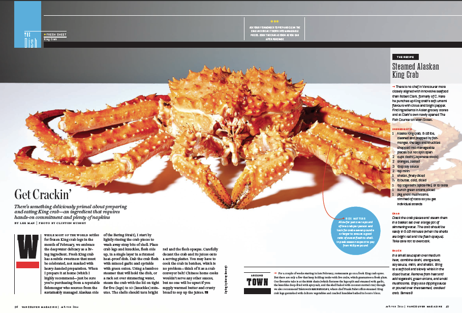
Vancouver used to frequently close-crop photos and run text around the edges of images. "We've banned that in the new book," Burns said. Now sections of photos are screened so that type can run over top.
The mag will also feature more portrait photography to capture the breadth of the city's population. "The job of a city magazine is to reflect the city. That's something I felt we could do better, in terms of visually representing the people, and the diversity of people, that live in Vancouver," said Burns.
Editor-in-chief John Burns says the magazine lacked a cohesive identity. "The stories sounded different between the beginning and the back of the book. Visually, some parts were highly packaged and others were more loose and airy," he said.
 |
|
Vancouver magazine unveils a new look with the January/February 2014 issue
|
The new approach breaks down silo walls that have built up over the years. Sections walk in step using the same colour palette, font choices and photo treatments, and navigation has been made easier with signposts. Content-wise, tone of voice has been made more consistent.
Each cover indicates an overall package for the issue, like whether it is a Wine Awards or Entertainment issue, for example. "Not that we didn't put those things on the cover before, but we also put 1,800 other things on the cover as well," said Burns. The logo has been redone with a version of the mag's new Miller body font.
 |
|
Signposts, like 'The Dish' above left, help with section navigation
|
Vancouver used to frequently close-crop photos and run text around the edges of images. "We've banned that in the new book," Burns said. Now sections of photos are screened so that type can run over top.
The mag will also feature more portrait photography to capture the breadth of the city's population. "The job of a city magazine is to reflect the city. That's something I felt we could do better, in terms of visually representing the people, and the diversity of people, that live in Vancouver," said Burns.
Comments (2) Post a Comment
Most Recent News Comment
 |
|
| Jaded says: | |
Wow, Torstar really seems to be on a mission to bankrupt one magazine after another.... |
|
Most Recent Blog Comment
 |
|
| Lorene Shyba says: | |
Full of terrific information, Thanks!... |
|
Most Read Stories
Special Reports


