Canadian Publishing Industry News
13 March 2014, TORONTO
Maclean’s website gets design makeover
Maclean’s redesigned website has a new tile-based responsive design.
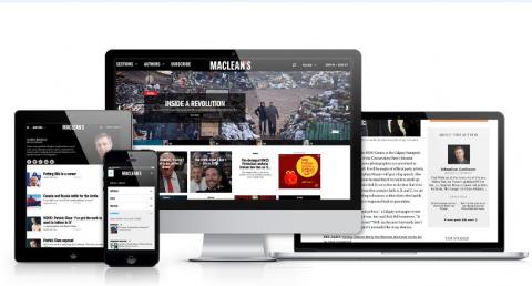
The new website—which now automatically configures its size depending on whether the viewer is on a desktop, smartphone or tablet—has an easier navigation, a cleaner look and larger photographs.
Sue Allan, managing editor of digital, said the redesigned website was inspired by a need to better showcase the work being done by Maclean’s. "We wanted to break down that distinction between work that was produced for the weekly magazine and the daily file," she told J-Source.
As a result, the clunky blogs hub—Blog Central—is now gone, replaced by a drop-down menu that lets readers sort by author and section. Articles are now arranged in large tiles, and every article on the home page is accompanied with a visual.
This tile-based responsive design layout has been rolled out across all Rogers’ consumer magazines—including Chatelaine, Flare, Canadian Business, MoneySense and L’Actualité—over the past two years, with Maclean’s being one of the last magazines to be redesigned.
Ryan Trotman, senior director and digital publisher of Rogers Publishing, said the responsive design delivers on a promise to readers to be available on all platforms. He wouldn’t disclose how much the company invested in the project, but said with the company’s shared resources, the redesign cost less than it would have for a comparable independent magazine.
Trotman said content is not curated or edited differently for the various platforms.
"I don’t necessarily subscribe to the idea that readers want to read different edited content on the mobile desktop," he told J-Source. "We’ll deliver the consistent approach and good content everywhere."
To continue reading this story, visit J-Source.ca where it was originally published.
The new website—which now automatically configures its size depending on whether the viewer is on a desktop, smartphone or tablet—has an easier navigation, a cleaner look and larger photographs.
Sue Allan, managing editor of digital, said the redesigned website was inspired by a need to better showcase the work being done by Maclean’s. "We wanted to break down that distinction between work that was produced for the weekly magazine and the daily file," she told J-Source.
 |
|
The redesigned Maclean's website (Courtesy of Rogers Media)
|
As a result, the clunky blogs hub—Blog Central—is now gone, replaced by a drop-down menu that lets readers sort by author and section. Articles are now arranged in large tiles, and every article on the home page is accompanied with a visual.
This tile-based responsive design layout has been rolled out across all Rogers’ consumer magazines—including Chatelaine, Flare, Canadian Business, MoneySense and L’Actualité—over the past two years, with Maclean’s being one of the last magazines to be redesigned.
Ryan Trotman, senior director and digital publisher of Rogers Publishing, said the responsive design delivers on a promise to readers to be available on all platforms. He wouldn’t disclose how much the company invested in the project, but said with the company’s shared resources, the redesign cost less than it would have for a comparable independent magazine.
Trotman said content is not curated or edited differently for the various platforms.
"I don’t necessarily subscribe to the idea that readers want to read different edited content on the mobile desktop," he told J-Source. "We’ll deliver the consistent approach and good content everywhere."
To continue reading this story, visit J-Source.ca where it was originally published.
— Tamara Baluja
Post a Comment
Most Recent News Comment
 |
|
| Jaded says: | |
Wow, Torstar really seems to be on a mission to bankrupt one magazine after another.... |
|
Most Recent Blog Comment
|
|
| Lorene Shyba says: | |
Full of terrific information, Thanks!... |
|
Most Read Stories


Masthead Web Edition Archives
More Archives